Written by Allen Wyatt (last updated November 21, 2020)
This tip applies to Excel 2007, 2010, 2013, 2016, 2019, and 2021
When Rod tries to add data labels to a column chart (Chart Design | Add Chart Element [in the Chart Layouts group] | Data Labels in newer versions of Excel or Chart Tools | Layout | Data Labels in older versions of Excel) the options displayed are None, Center, Inside End, and Inside Base. The option he wants is Outside End.
In doing some testing, it appears that what Rod may actually be working with is a stacked column chart and not a normal column chart. The reason I say this is that we could only replicate the problem if the chart type was stacked column; if it was a normal column chart, then the Outside End option was available, as expected.
If it is indeed the case that Rod is using a stacked column chart, then it makes sense that Excel wouldn't offer Outside End as that option wouldn't make a lot of sense—where would one expect Excel to display the labels for more than a single data series if the series are stacked into single columns?
If Rod double-checks and finds that the problem is really with column (not stacked) charts, then it could be that there is a problem with the workbook in which the charts are being created. This can be confirmed by creating a new workbook from scratch (not by copying data or worksheets) and then creating a column chart in that workbook. If the Outside End option is there—as it should be for a column chart—then you'll have a good indicator that the problem is with the other workbook itself.
ExcelTips is your source for cost-effective Microsoft Excel training. This tip (12608) applies to Microsoft Excel 2007, 2010, 2013, 2016, 2019, and 2021.

Excel Smarts for Beginners! Featuring the friendly and trusted For Dummies style, this popular guide shows beginners how to get up and running with Excel while also helping more experienced users get comfortable with the newest features. Check out Excel 2019 For Dummies today!
If you chart data that includes dates along one of the axes, you might be surprised to find out that the chart includes ...
Discover MoreAdding labels to a chart can make the information presented in the chart more understandable. Excel allows you to add ...
Discover MorePlace a chart on a worksheet and you may not be satisfied with its size. Changing the size of a chart is a simple process ...
Discover MoreFREE SERVICE: Get tips like this every week in ExcelTips, a free productivity newsletter. Enter your address and click "Subscribe."
2025-03-31 13:39:01
Jane
I've been stuck on this for a bit and couldn't find the answer anywhere else, thanks for the very helpful tip!
2021-05-10 10:09:30
Doris Mearig
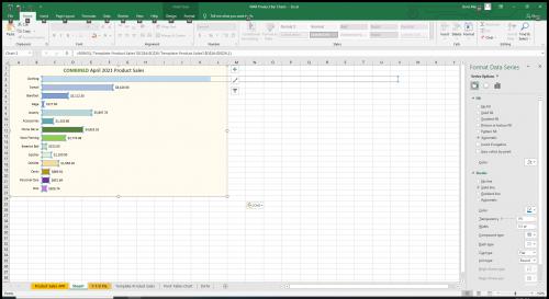
(see Figure 1 below)
I have a bar chart that does not allow me to add a data label for a specific bar on the chart. That bar shows an extended boundary outline and although I can change the data label position/alignment for the chart, it does not apply the change to this specific category. I am sure there is a simple explanation but I can't determine how to eliminate that extended boundary that extends beyond the chart area.

Figure 1. Bar chart with missing data label
2021-04-06 11:07:16
scott
i just wanted to say that I have been trying to solve this problem for the last 2 days. I could never figure out why some bar charts had data values in the line and some at the end. You were correct, it was the style of bar chart the system was choosing for me. 1 with it inline and another with data label at end. THANK YOU!
Got a version of Excel that uses the ribbon interface (Excel 2007 or later)? This site is for you! If you use an earlier version of Excel, visit our ExcelTips site focusing on the menu interface.
FREE SERVICE: Get tips like this every week in ExcelTips, a free productivity newsletter. Enter your address and click "Subscribe."
Copyright © 2026 Sharon Parq Associates, Inc.
Comments